Earlier today, we proudly released our new home shirt which we will wear for the 2020/21 and the 2021/2022 seasons. The shirt itself is an evolution on past kits we’ve worn whilst maintaining the club’s progressive values.
The kit features a fusion between an adaption of a kit submitted by designers Mockup FC to our open competition inviting kit ideas, whilst incorporating the clubs brief regarding keeping it ‘1874’. Once again, the shirt has been made by Ian Senior at SK Kits, our long-standing kit supplier. During the last week, I spoke to the man behind the creative process Luke Bushnell-Wye.
Luke started the interview by telling me how “stunned,” he and other board members were to the response of the initial kit competition.
“We were stunned with the response that we got, and when the time came to whittle them down at the start of 2020 it was a tremendously difficult job. In the end, we narrowed it down to two, and then one which we just felt would be more versatile as a design. Having adapted the pattern in the original design to suit us and just as lockdown was starting, I got some templates made up with Ian at SK. I had to present these over virtual board meetings and we picked the application of the pattern that we liked the best – a slightly toned-down version with the fade.”
It is clear that from the outset that he and the rest of the board made a conscious effort not to emulate the bold away kit design.
“There’s more freedom with an away kit to do something different, whereas the home kit has to represent the club and not stray too far from tradition. I think we’ve produced something that is strikingly different, and yet instantly recognisable as an 1874 Northwich kit, and that was the aim.”
One of the aims that Luke spoke about was making sure that the kit matched the overall ethos and ambition of the club.
“It is absolutely crucial that the kit matches the ethos of the club. A club’s brand isn’t just what colours you play in and what kind of football you play, it’s also what you stand for off the pitch and what kind of club you want to be. People know the story of 1874; forward thinking is in our DNA.”
The shirt has several subtle details to it, one of which is to pay tribute to our NHS and Social Care workers with the rainbow pattern on the hem of the shirt.
“The NHS and other frontline workers have been crucial and I’m happy to pay tribute to them with the rainbow symbol on the hem. It’s a simple gesture, but the rainbow also represents hope at the end of the storm, and when we see our players on the pitch wearing this kit, it will be thanks in part to the efforts of those vital workers that we will have reached that point.”
Another detail is the Roman Numerals representing the formation of the club and Luke felt it was vital to acknowledge that moment.
“The numbers on the side represent the foundation date of the club, the meeting at which members voted to start their own club. Without the decisive steps taken at that meeting, we wouldn’t be here talking about this kit today, so I’m delighted to have the chance to include a reference to it in this shirt. I think of it like a reminder to strike out, be bold, and take responsibility. I find it inspiring to think of, so I hope the players do too when they wear it. I’m delighted with the overall design. I set out to take the best elements from the winning design and bring them into a kit that is quintessentially ’74’, and I think the result speaks for itself.”
Making a shirt “quintessentially 74,” was something that Co-manager Wayne Goodison also felt was crucial.
“We all really like it. For me, Paul and the players we have been involved in the process and seen how its developed and we feel it captures our identity. The players have been consulted on certain aspects of the kit because they have to be comfortable in the shirt and they’re looking forward to wearing it!”
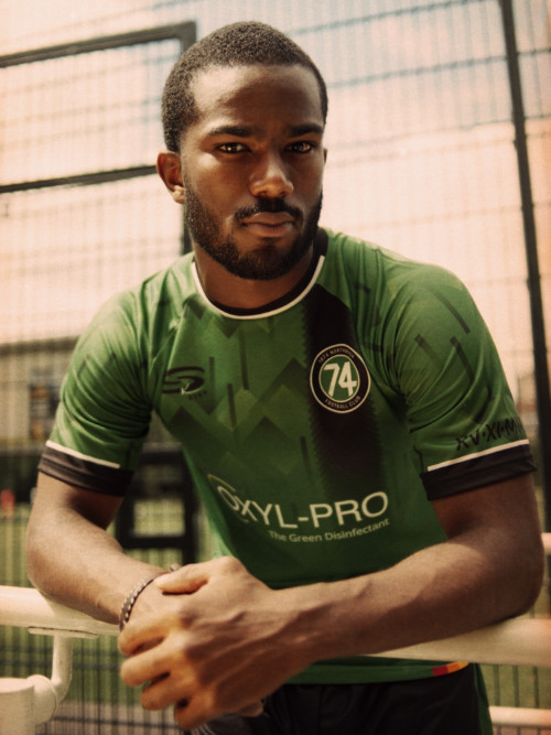
2020 Home shirt
2020 Home Kit
A quintessentially ’74 kit evolution, ready for the next chapter. Created from the results of an open design competition.
Featuring our new shirt sponsor Oxyl-Pro and produced by SK Kits.
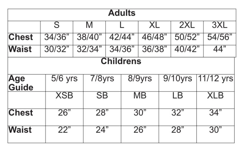
Size guide
Please note that orders for shirts with numbers on can take a little longer to be despatched as we hold limited stock. Covid-19 conditions may affect delivery times